I just released an Android version of my Cats Idol pet project – it lets you browse through photos of cats submitted by other people, rate the cats, and set the photos as your Android wallpaper.
One of the things I wanted to do was to provide users with the ability to upload photos straight from their phone. I decided that a web interface would be the easiest way to go at it. So, my application has a button called “Add cat” that launches the Android web browser with a URL of my server-side CakePHP-based upload HTML form.
The Problem
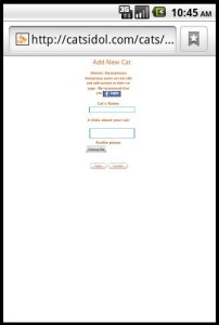
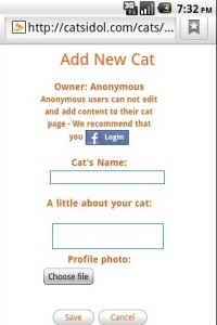
Then I ran in to a problem – The HTML upload page was “zoomed out” on android, seemed like the browser did not scale the HTML properly and you needed a lot of zooming in order to work with it.
I thought this was a problem with my android code but found that it was actually a server-side issue.
After some digging, I found a solution to this issue.
The Solution
Adding these two Meta Tags in the head Tag of the HTML page solved this issue:
<meta name="HandheldFriendly" content="true" />
<meta name="viewport"
          content="width=device-width,
                 height=device-height, user-scalable=no" />

In CakePHP I added these Meta Tags to the mobile.ctp layout so it will affect all pages using the mobile layout.
Using these Meta tags fixed the way Android showed the HTML web page – The page looks zoomed-in and fits the screen very nicely:


Thank You, I Had the same problem, Where I can get more information about meta tags configuration, available to android?
Thank You
Daniel Bueno
@Daniel – I was just looking for “how to fit webpage to android browser”, and found this page and this one:
http://developer.android.com/guide/webapps/targeting.html
God bless you, friend.
This was perfect. Thank you for this post!!
thanks. You saved my day!!!
Thank you.. Its really helpful..
i am also facing same issue ,i tried your suggestion but it is not working.can you please suggest me any solution that will fit the webpage within the device width and height
Thanks for tutorial. It’s very useful for me